Smart Mapping provides a data-driven approach to symbolizing layers and exploring data. When changing style the choices you see are determined by the nature of your data. Once you have decided the initial form of your features—for example, circles or colors to show population—you can make choices to change their appearance, such as choosing colors, line weights, transparency, and more.
Interesting effects can be created by duplicating layers and applying different styles to each layer. Here’s how to create a glowing double ring effect using this technique.
Introduction
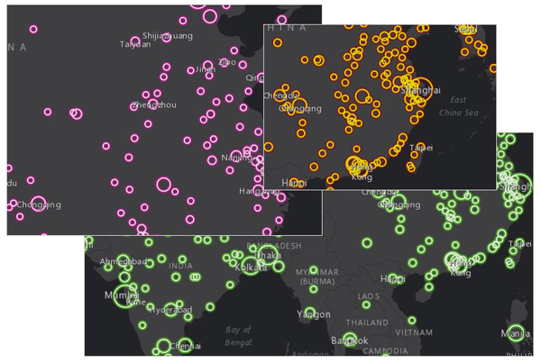
One of the potential considerations when using proportional circle maps is that the larger circles cover smaller circles, and it may be difficult to view map details beneath them. Using hollow circles (outlines with no fill) helps solve this problem.
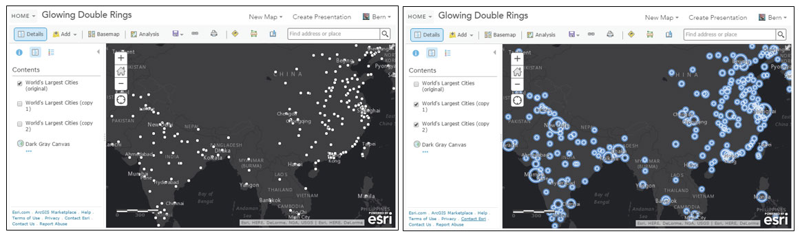
You can also overlap layers using different colors and transparency to create a glowing double ring effect, detailed here. Follow along using the provided sample map, or use your own map with layers having numeric values suitable for the Counts and Amounts (Size) drawing style. The sample map includes the original layer (left) plus the copied layers showing the result (right).
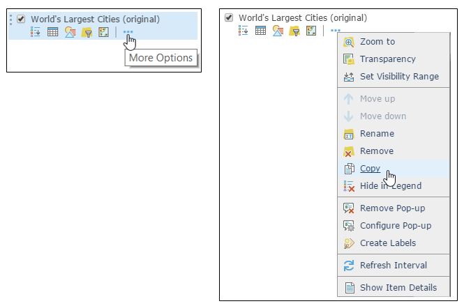
Step 1. Open the sample map (or your own map), and create two copies of the layer. To copy a layer, open the context menu to show More Options, and choose Copy.
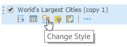
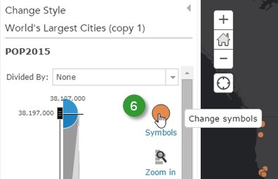
Step 2. Using the first copy of the layer, click Change Style.
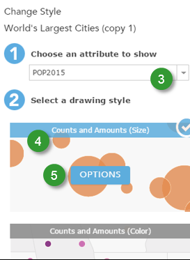
Step 3. Choose POP2015 from the attribute list. Any numeric field can be used.
Step 4. Choose Counts and Amounts (Size) as the drawing style.
Step 5. Click Options to change the style.
Step 6. In Change Style, click Symbols to change symbols.
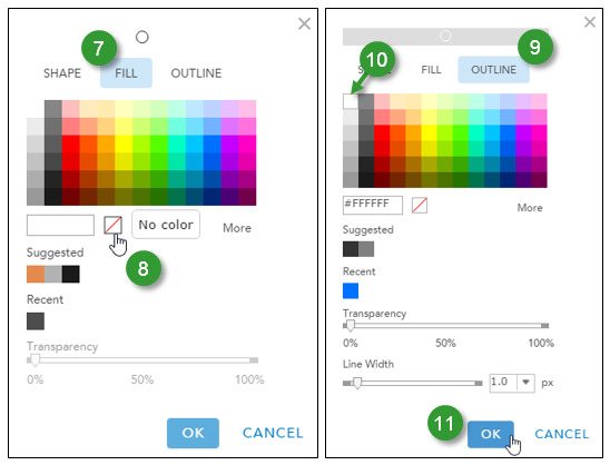
Step 7. Click Fill to adjust the symbol’s fill properties.
Step 8. Set the fill for No color, making the interior of the shape completely transparent.
Step 9. Click Outline to adjust the symbol’s outline properties.
Step 10. Choose white for the color of the outline.
Step 11. Click Ok to save your changes.
Click Ok and Done in the subsequent panels to accept your changes for the layer. You’re now finished with the first layer.
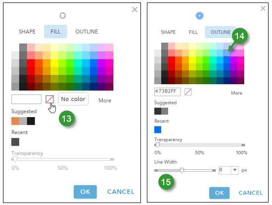
Step 12. Begin a similar process with the second copy of the layer, following through Step 6 above.
Step 13. Choose No color again for the Fill.
Step 14. Click Outline and choose a color for the outline other than white – a medium blue is a good color to choose.
Step 15. Adjust the line width to 6 or 8 pixels or so, then click Ok.
Step 16. Click Ok and Done in the subsequent panels to accept your changes for the layer. You’ve now completed symbol changes for the second layer.
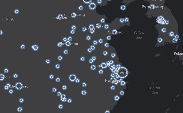
Your map should look similar to this:
Tip: Experiment with additional layers, different widths, colors, and transparency settings to achieve the desired effect.
For more information
Thanks to Mark Harrower for contributions to this post

Article Discussion: