Mapping Climate Change: Ways to Envision What's Happened Already, and What Is to Come
As the climate talks open in Paris, here is an instructive set of “story maps” from our friends and partners at the geographic-information company Esri, showing dimensions of the challenge and the opportunity.
The maps are actually most impressive in their full native setting, which you can find by clicking here. The interactive, embedded version below will give you an idea of what else you can find.
As a start for navigation, you use the large arrow keys at the bottom of the maps to go forward and backward to different sections. You can zoom into a map, and pan around to different areas; many pages also have a Legend tab, which explains the color coding.
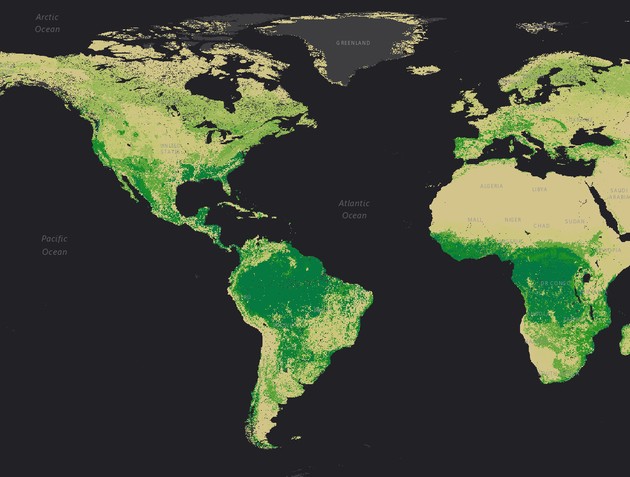
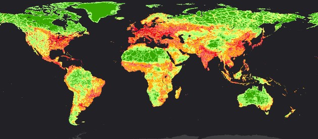
Here’s another sample I find interesting. It measures “human footprint,” with red and purple representing greatest impact of human activity on the natural landscape, and green the least. The green areas here range from places that in real life are verdant green, mainly in the Amazon, to those that are sere and brown, in the Sahara or the great central Australian desert. Or white, as in the polar regions.
Thanks to Allen Carroll and others at Esri for producing this collection.